Accordion
The Accordion layout is a layout that manages multiple Panels in an expandable
accordion style such that by default only one panel can be expanded at any given
time (set multi-config to have more open). Each Panel has built-in support for
expanding and collapsing.
Only panels and all subclasses of
Ext.panel.Panelmay be used in an accordion layout container.
Exercise
- (Re-)open your
index.htmland update the code creating theExt.container.Viewportcomponent to match the following snippet:
Ext.create('Ext.container.Viewport', {
    layout: 'accordion',
    defaults: {
        bodyPadding: 15,
        border: false
    },
    items: [{
        title: 'Item 1',
        html: 'Content 1'
    }, {
        title: 'Item 2',
        html: 'Content 2'
    }, {
        title: 'Item 3',
        html: 'Content 3'
    }, {
        title: 'Item 4',
        html: 'Content 4'
    }]
});
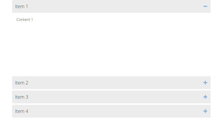
- Reload the page in the browser and take a look at the result: