Border
The Border layout is a multi-pane, application-oriented UI layout style that
supports multiple nested panels, automatic bars between regions and built-in
expanding and collapsing of regions.
When using this layout note, that any container using the border layout must
have a child item with region:'center'. This child item in
the center region will always be resized to fill the remaining space not used by
the other regions in the layout. Any child items with a region of west or
east may be configured with either an initial width, flex or an initial
percentage width value. Any child items with a region of north or south
may be configured with either an initial height, flex value or an initial
percentage height value.
Exercise
- (Re-)open your
index.htmland update the code creating theExt.container.Viewportcomponent to match the following snippet:
Ext.create('Ext.container.Viewport', {
    layout: 'border',
    defaults: {
        bodyPadding: 15,
        collapsible: true,
        split: true
    },
    items: [{
        title: 'Item 1',
        region: 'north',
        height: 100,
        html: 'Content 1'
    }, {
        title: 'Item 2',
        region: 'east',
        width: 150,
        html: 'Content 2'
    }, {
        title: 'Item 3',
        region: 'west',
        width: 150,
        html: 'Content 3'
    }, {
        title: 'Item 4',
        region: 'center',
        html: 'Content 4'
    }]
});
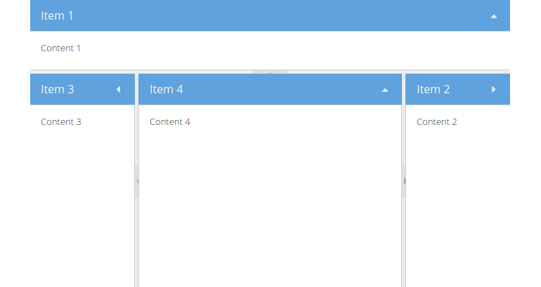
- Reload the page in the browser and take a look at the result: